
This article overviews how to use the SenseMaker method to shift analysis away from external experts to project teams. The article reflects experiences of leading teams of international NGOs and local NGOs in group analysis in Bangladesh, Indonesia and Timor-Leste. The mix of technology used by SenseMaker and social process (i.e. Robert Chambers, power reversals) can create groundedness for project implications in complex environments. If you are interested in a simple review of SenseMaker go to Making Sense of Complexity.
Robert Chambers masterfully compared the development industry to Hans Christian Anderson’s classic “The Emperor’s New Clothes”. Anderson tells the story of an emperor who was fooled by visiting, expert weavers. They convince the the emperor they could make for him the finest quality clothes and those who could not see these clothes were ignorant. The story ends with the emperor naked in a parade showing off his “new clothes” and a child being the only one willing to point out this insanity.
Chambers places those with funding (i.e Donor to INGO; INGO to LNGO; LNGO to community) as the unwitting, naked emperor – those in less powerful positions fearing to say the true challenges they face. He poses the one with the least power – a child – stating the obvious: the emperor is naked. The story finishes with the emperor initially feeling shame because he had been lied to; he is eventually happy the truth was revealed. The child who was brave enough to say he was wearing no clothes is rewarded, revealing the Emperor’s desire to see a non-fabricated reality, even if it meant walking through the initial depth of shame.
This story is a story of power. Those who control the discourse control reality. To shift power, Chambers suggests six important reversals for international development:
Verbal → Visual; Closed → Open; Measuring → Comparing; Individual →Group; Higher → Lower; Reserved to Rapport →Frustrating and Fun.
SenseMaker in itself does not necessarily create these shifts. However, the technology used correctly has a higher potential to create these shifts compared to traditional data analysis approaches.
Verbal ⇒ Visual- Chambers (as well as the liberation educator Paulo Frieri) promotes the shift from verbal to visual. In community projects, this is often seen through use of flip charts, ranking, cause and effect exercises, or acting. The ease of visualization is one of the most powerful and empowering components of SenseMaker.
Collecting data. First, the collector application during data collection is user-friendly enough that participants use visuals to make meaning of their story. Participants are encouraged to use tablets themselves. This is similar to a classic participatory exercise however on a tablet – enabling analysis of participatory activities (which is often difficult to quantify accurately). The below triad shows visual of participants moving the square in the middle to self-code their story.
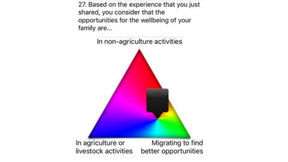
Active Participation. Secondly, if participants do not feel comfortable to use the tablets, data collectors can easily make the same visual participatory exercises that are on the tablets through using branches, ropes, paper or rocks. They then signify the on the tablet until participants feel comfortable with the participatory visuals on the tablets. Using tablets makes the data easily analyzed compared to traditional participatory exercises that are difficult to quantify.
 Analysis. Finally, during analysis the software itself allows participants to create and interpret visuals quickly and easily. Visualization is key to telling the story. People who have the power to tell the story control the discourse of what is happening. If group facilitation is used, the ease of visualization encourages the shift of power for communication of trends to people on project teams who normally have less power within the project team but have extensive project experience.
Closed ⇒ Open. The design of the questions connected with how the questions are interpreted promotes an emic expression of reality. The first question is a prompt question which is the narrative of the participant. For example, “Tell me about the best moment in your life. Tell me in a story like you were telling a good friend.” This narrative is recorded and reference in the rest of the framework.
Further, every question asked for substance after the prompt question is to see the emic understanding of the narrative. The respondent self-codes their narrative through a structured set of participatory, visual, comparative codes. Analysis is grounded in the coding efforts of the participant who told the initial story.
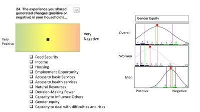 Measuring ⇒ Comparing. Emergent or complex environments lead towards a need to understand relative comparison. Viewing relative comparability through visuals is a powerful tool. Question 24 (left) reflects the ease at which this comparison can take place through participants using simple drag and drop on the software used for analysis. In this analysis, more women than men said they experienced gender equity due to a crisis. Further, women found this much more positive then men (as seen though the mean or red line).
The second example of this is seen below. A question was asked that had two purposes. Firstly, it showed how many people experienced changes in core parts of their human experience due to a natural hazards. Secondly, it showed whether the experience was negative or positive. These questions were filtered by two populations – vulnerable and resilient – to see if there was a difference in their experience of core domains.
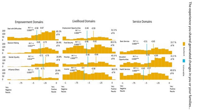
The purpose of this is the comparable difference between those who had been classified as vulnerable and those who had been classified as resilient. People who were vulnerable have a more negative experience with changes in core parts of their humanity than those who are resilient.
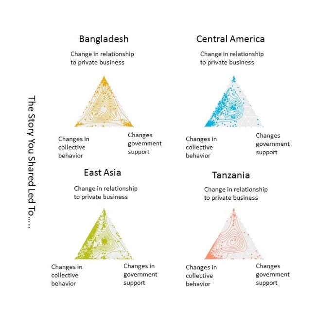
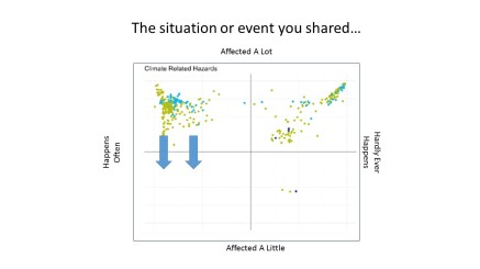 Although it is possible to show exact values with software like SPSS or R, it is just as powerful (possibly more powerful) to have groups pose potential vector movements. For example, a team from Indonesia identified that 90% of participants’ stories were related to climate. Of these, 60% of participants signified the hazard in their stories was related to climate and “affected a lot” and “happens often” (see image above).
For program outcomes, the team identified they cannot change how often hazards occur, but they can change the perceived effect the hazard has on people. They posed to monitor vector movement over time towards hazards “Affecting A Little”.
Individual ⇒ Group. Often analysis is done by people who are considered “experts”. Sometimes, these experts live thousands of miles away from the context of the research. Structuring analysis in a format that includes project teams, increases the chance to apply findings and provide a better quality understanding of meaning. For group analysis it is important to:
- Create hermeneutic teams. Pre-group your analysis into ways you would like to read the data. For example, the conceptual framework of a resilience project might divide questions by coping, adapting and transforming actions. The signification framework (questions) might look at these from various angles to reach triangulation. Design your groups to each take a piece of this puzzle and have times of feedback built into the process.
- Who is in the room is important. It is important to have participation from as near the research participant level and as high of project leadership as possible. You want to both be able to understand grounded realities and have people in the room who can make project decisions based on emerging findings.
- Develop a clear, open but structured environment. Finding the balance between open and structured is the facilitator’s art. Do not allow your day to become directionless or get sucked into the endless possibilities your beautiful data presents. Clear guidance, boundaries, and openness help participants explore on their own. One technique that helps with this is to form your day around outputs that each team will turn in at the end of the day. This both produces documentation that can later be drawn on and gives focus to the work.
- No matter how well you work as a group, individual time for write-up will be needed. The final write-up past the finish line often requires individuals to explain what the group explored and writing in simple language.
Higher ⇒ Lower. Traditionally, expert researchers analyze, interpret and submit a report. These experts rarely spend the time in the culture to understand its complexity or soaking themselves in thick descriptive data. Project teams or managers then are asked to reflect on the report. This can lead to reports not being read or not being grounded in day-in and day-out realities. Reflecting as a team on the data shifts the power of interpretation to the team rather than the international expert who flies in for two weeks and makes analysis with a very small understanding of the context.
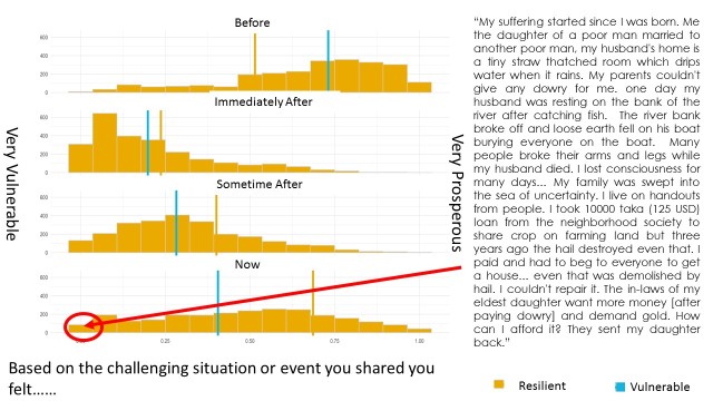
Further, the use of reading narratives connected to the signifier in each story is a powerful tool to bring project teams nearer the lived experience of communities members if community members are unable to join a time of analysis. The below diagram shows a story from a woman in Bangladesh that signified she was still very vulnerable years after the hazard she faced. The narrative gives keys to why this is.
Reserved to Rapport ⇒ Frustrating and Fun. This is one of the most interesting of Chambers’ categories. The group process of looking at data together and setting a stage of go-discovery creates moments of celebrating discovery and sharing frustration together. Simply put: learning together is fun.
This article solely reflects the thoughts of the author and does not in any way reflect the authors employer. Many participants took part in developing the research from which the lessons about analysis discussed in this article was pulled. I had the opportunity to work with Edu Mungga, Maria Wijiastuti (Pippin) (Indonesia); Erin La Croix (Bangladesh); and Dena Lewerke, Paulo Belo, and Agus Ximenes (Timor-Leste) to name a few. As well as creating and analyzing the visuals myself and with the above team many of the visuals in this article were created by Mohit Holmesheoran, Amy Hilleboe and Maria Veronica Gottret. Finally, Rita Muckenhirn and Maria Gottret developed many of the participatory data collection techniques (i.e. using sticks and stones when participants did not want to use tablets) discussed in this article.

This is the most useful overview of the process of applying SenseMaker that I have encountered
LikeLiked by 1 person
Thanks! That is very kind of you to say.
LikeLiked by 1 person